PAINTING BOTANICALS OUTLINE


1

2
2/3
4
Gather Supplies
-water
-paper towel / rag
-2 circle stencils, 1 and 2 in- I use a mason jar lid and a quarter!
-Pencil
-watercolor paper
-brushes
-palette
-3 primary paints: madder/alizarin, cadmium yellow, indigo/prussian blue
Watercolor Warm Up
Draw Color wheel
Use your 2in stencil to draw your center circle first (gray).
Draw your 3 primary 2in circles, equally spaces around the center (magenta, yellow, blue).
With your 1in stencil, draw one circle in between your primary circles for the secondary (orange, green, purple).
Color mixing
Fill-in your Primaries, straight from the tube. Alizarin/Madder, Cadmium Yellow, and Indigo/Prussian Blue. Begin with yellow, match the diagram to the left. Mix enough water in with the paint that it is saturated and flows freely. Use a large brush, use a lot of juicy paint, and try to wet the entire circle quickly, so that it doesn’t begin to try as you’re filling it in. Fill in Magenta, then Blue.
2. Fill in your Secondaries. Choose a 1in circle to start with, then mix together the primaries next to the chosen circle, to create a secondary color. For example, if I choose my top right circle, I would mix yellow and orange to create orange. Mix yellow and blue to create green, then red and blue to create purple. Try to mix colors in equal amounts, aim for a hue right in-between the primary colors. You don’t want yellow-green or blue green, you want a true middle green.
3. Fill in your Neutral Gray, center circle. Mix together all 3 primary colors to create a neutral hue. If the neutral begins to tend towards a certain hue, add the color’s compliment. Complimentary colors are located straight across the color wheel from each other. For example, if my grey was tending red, I would add green to get closer to a neutral gray.
2.TINTING: VALUE AND SATURATION
Draw a 3 lines of 1in circles. You may need a new sheet of paper for this exercise. The first line should have 5 circles, the next 6, and the next 7. We will be creating value scales from as dark as possible, lots of pigment little water, to as light as possible, lots of water little pigment.
Begin painting on the right side of the first line of 5. Use paint that is mostly water and a drop of pigment to get the lightest shade you can.
Add a drop more pigment and paint in the next circle, moving left. Keep in mind that we want the to evenly space out the jumps in value to create a gradual transition.
Continue left circle by circle, painting the leftmost as dark as possible.
Continue on to the next rows following the same steps. Each time a circle is added to the row, it will be more challenging to keep your value steps even.
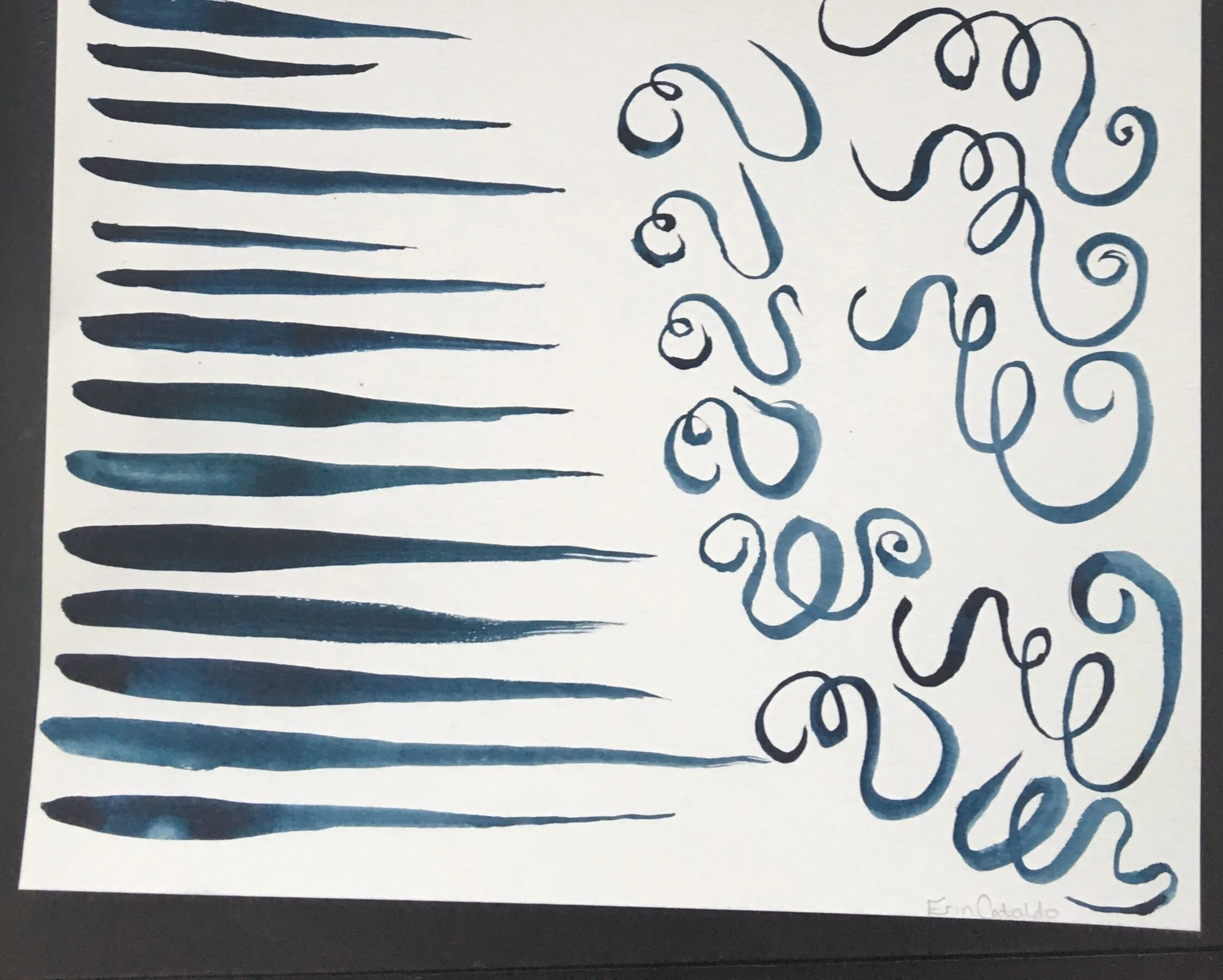
STROKE: LINE WEIGHT
Fill your brush with saturated, juicy paint.
Create a tapered line by dragging the brush across the page, first moving slowly and applying a lot of pressure, then gradually lightening up and moving faster. This will create a line that smoothly transitions from thick to thin.
Do this several times, focusing on keeping the transition smooth and steady. Our goal is to move from as thick as possible to as thin as possible.
Try varying the length of your line. Is it harder to make long or short tapered lines?
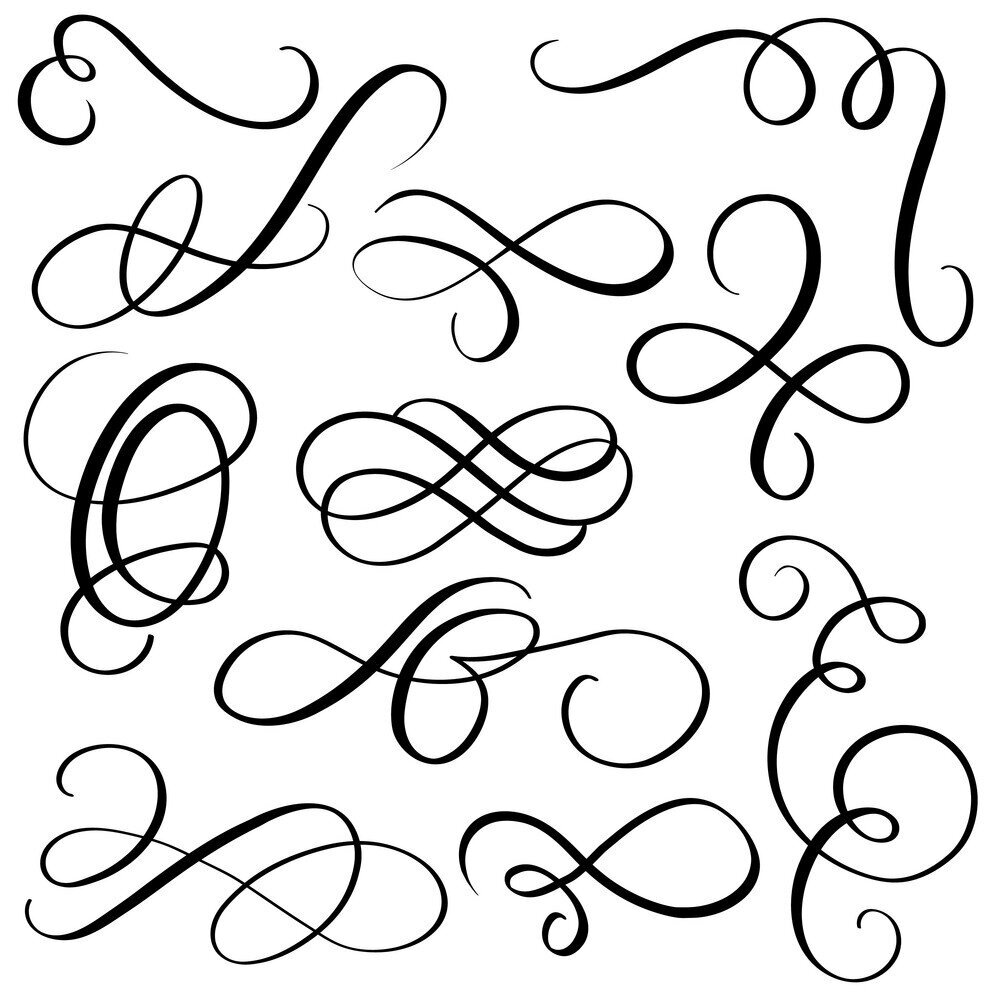
3. STROKE: MARK
Choose a calligraphy flourish from the image on the left. Replicate this shape with your paintbrush. Try to match the line weight, think about where the line is thicker vs thinner.
Repeat the same shape 5 times. Try to make each shape exactly like the others, our goal is consistency.
Try this again with at least 2 other shapes.
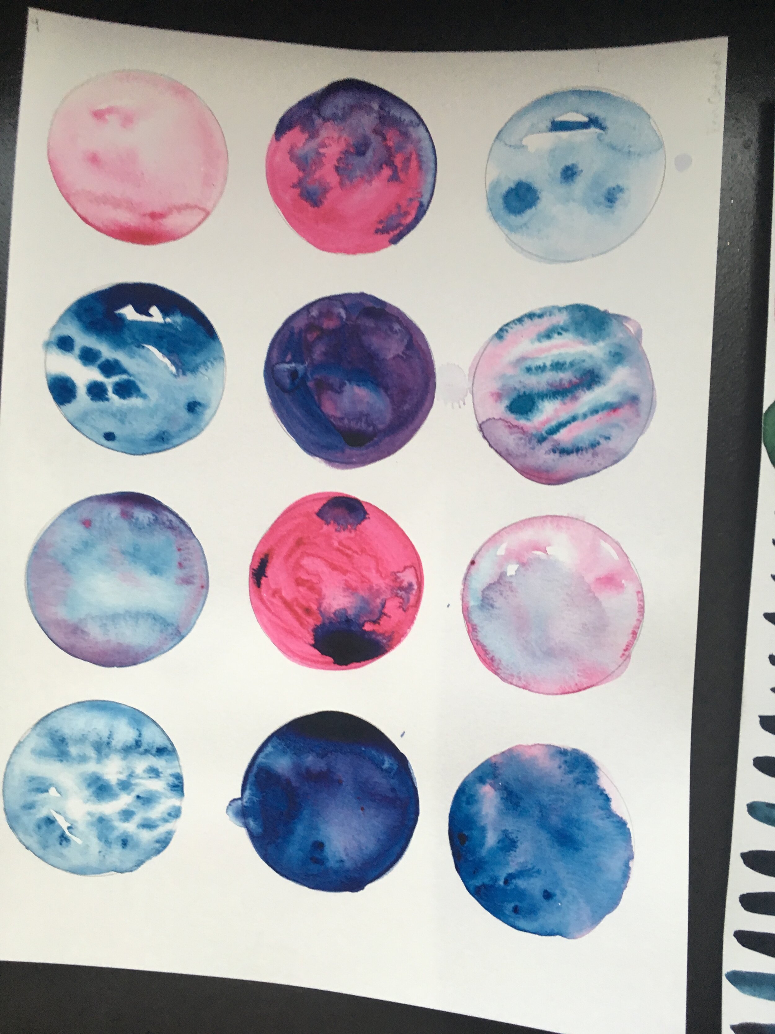
4. WET BLENDING
-Use the large circles at the top of the page to practice blending colors.
-Begin by filling one entire circle with water. Then, fill your brush with paint and gently touch the tip of the brush to the wet circle. Watch the way the color spreads and creates ridges as it dries- this effect is called a bloom.
-Choose a cricle to experiment with the oppoite effect- fill the circle with a dark value of paint, and while it’s still wet, touch a brush full of water to the shape- watch the way the water pushes the pigment on the page outward from your brush.
Putting the Techniques to Work: Painting from Life


=


1- Painting with Calligraphic Lines
Practice painting with only calligraphic lines.
-Keep you paint a dark, saturated value.
-Paint like you’re drawing with a marker-Be mindful of your line weight, pushing your brush into the paper to created wider lines in places that are in shadow or darker. Use smaller, thinner, lines for delicate details and soft edges
2 - Painting Wet on Wet
Practice paintingwith no lines, using the wet on wet blending technique
-Wet the paper one petal at a time to control which areas bleed into one another.
-Drop more paint in areas that are in shadow
-Create blooms in areas that are logical to your bloom-to blend colors and/or to mimic textures
3 - Combining Techniques
-Begin this step by repeating the wet on wet technique from exercise 2, making adjustments this time to fine tune the color and value placement.
-Next, asses your edges- where you aren’t happy with the edges created by painting wet on wet, or where detail needs to be added, add in some linework from exercise 1.
Planning a Full Page Composition
Below are some examples of illustrators, both modern and historical, that take a creative approach in composing their natural science illustrations.

Maria Sibylla Merian,
“Mullberry Leaves and Fruit”, 1830
This artist is mindful of the movement in her etchings, bending twigs into an oval frame and using realistic objects into decorative elements
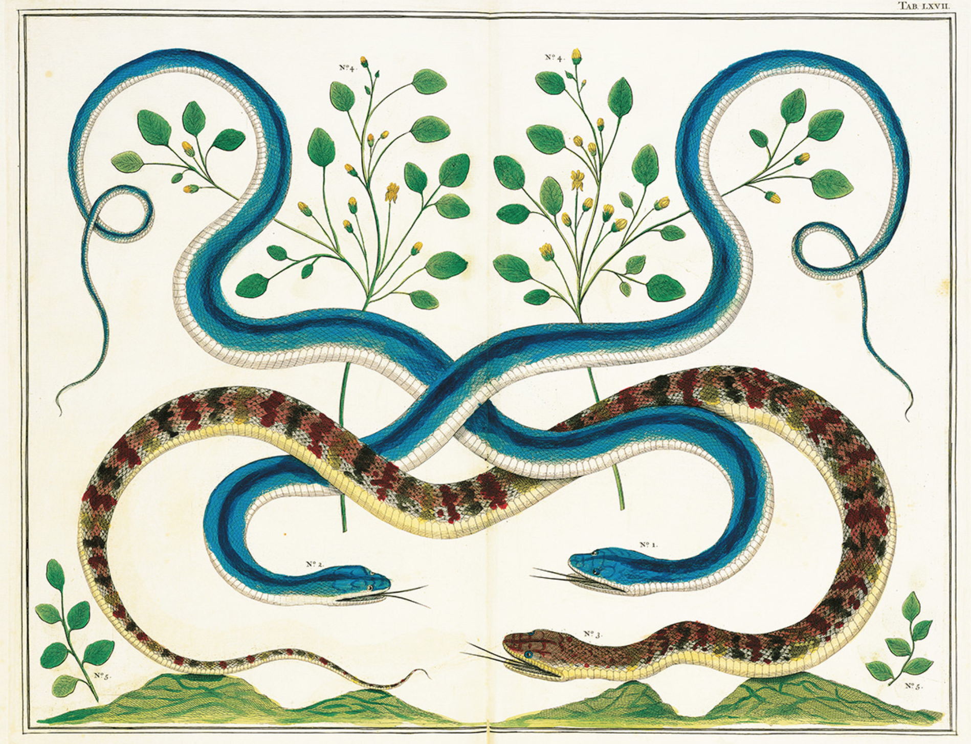
late 1770s
Seba’s strong suite is symmetry, his series of snake prints use the bodies of the animals as line to make patterns across the page. He often includes hints of landscapes in his work.

Teagan White is the master of a limited color palette, while still achieving hyperrealism in her haunting paintings.

Ernst Haeckel,
Fungi : Plate #63, 1899
Haeckel’s work is highly technical and detailed, he chooses to stack the page with a cluster of black and white illustrations. Though they all have vastly different textures and shapes, the layout is symmetric and measured out in a grid.

John James Audubon,
Snowy Owls, 1882
I am personally so fond of John Jame’s Audubon’s use of a dark background with hints of cloud details, to contrast light colored birds in the foreground.

A Rainbow Of Fungi, 2017