
Watercolors for Beginners:
Glow Painting
Gather Supplies
-water
-paper towel / rag
-2 circle stencils, 1 and 2 in- I use a mason jar lid and a quarter!
-Pencil
-watercolor paper
-brushes
-palette
-optional- coarse sale

1
Watercolor Warm Up
Draw Color wheel
Use your 2in stencil to draw your center circle first (gray).
Draw your 3 primary 2in circles, equally spaces around the center (magenta, yellow, blue).
With your 1in stencil, draw one circle in between your primary circles for the secondary (orange, green, purple).
Color mixing
Fill-in your Primaries, straight from the tube. Alizarin/Madder, Cadmium Yellow, and Indigo/Prussian Blue. Begin with yellow, match the diagram to the left. Mix enough water in with the paint that it is saturated and flows freely. Use a large brush, use a lot of juicy paint, and try to wet the entire circle quickly, so that it doesn’t begin to try as you’re filling it in. Fill in Magenta, then Blue.
2. Fill in your Secondaries. Choose a 1in circle to start with, then mix together the primaries next to the chosen circle, to create a secondary color. For example, if I choose my top right circle, I would mix yellow and orange to create orange. Mix yellow and blue to create green, then red and blue to create purple. Try to mix colors in equal amounts, aim for a hue right in-between the primary colors. You don’t want yellow-green or blue green, you want a true middle green.
3. Fill in your Neutral Gray, center circle. Mix together all 3 primary colors to create a neutral hue. If the neutral begins to tend towards a certain hue, add the color’s compliment. Complimentary colors are located straight across the color wheel from each other. For example, if my grey was tending red, I would add green to get closer to a neutral gray.
Wet Blending
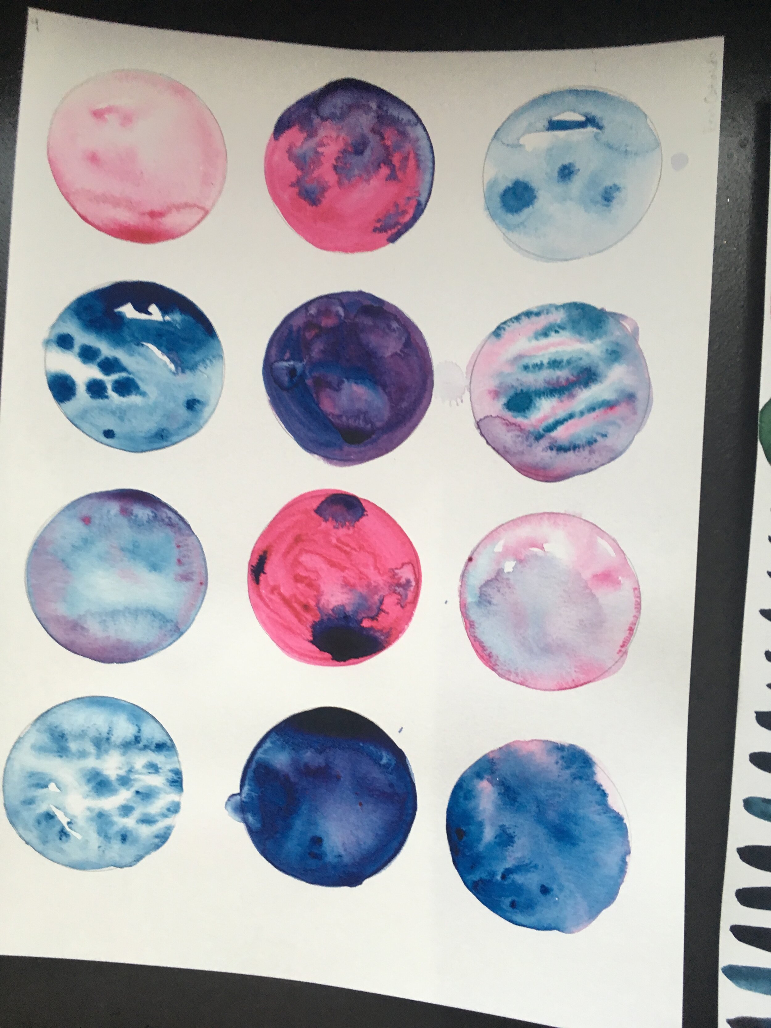
-Use the large circles at the top of the page to practice blending colors.
-Begin by filling one entire circle with water. Then, fill your brush with paint and gently touch the tip of the brush to the wet circle. Watch the way the color spreads and creates ridges as it dries- this effect is called a bloom.
-Choose a circle to experiment with the opposite effect- fill the circle with a dark value of paint, and while it’s still wet, touch a brush full of water to the shape- watch the way the water pushes the pigment on the page outward from your brush.
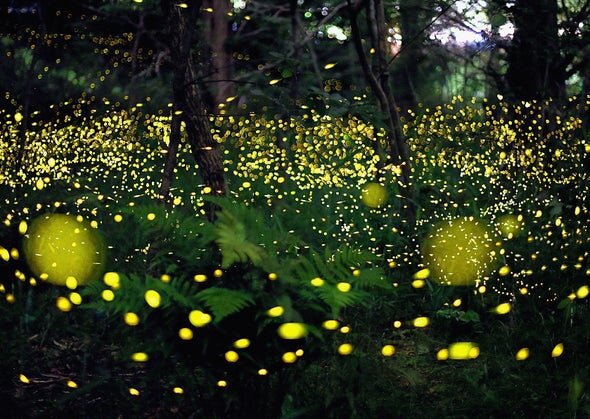
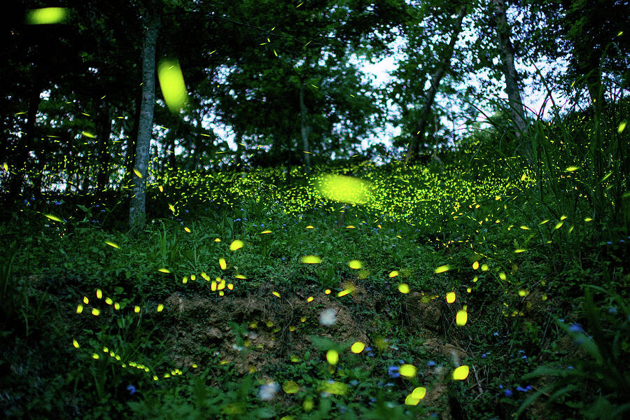
Color studies for fireflies
As you practice, consider shifting to more lifelike color schemes for glowing. Dark, cool toned background with warm, lighter centers. The mood shifts dramatically with the subtle color differences. Soft edges and gradients will help objects appear to glow.
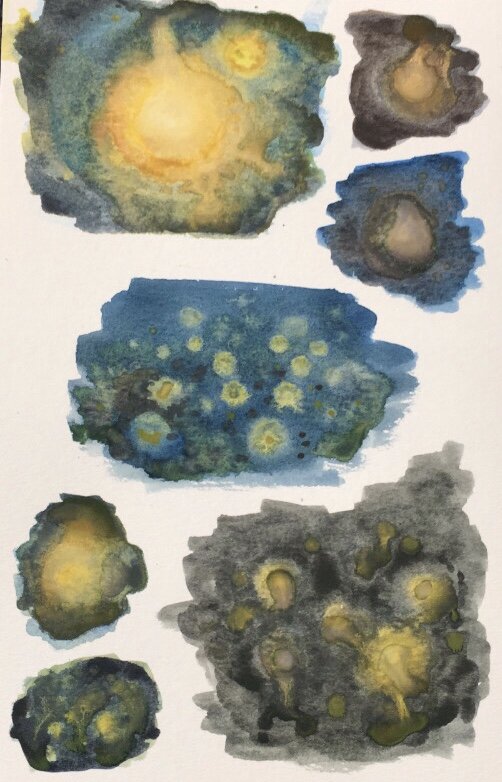
Step by Step Fireflies

Begin by laying out a variety of warm colored ‘orbs’. I’m working with yellow with a tad of red. Try to use a lot of water and work quickly, we want these to stay wet!

Working quickly and with a lot of moisture, lay down a background of toned blue (add yellow and red to turn the color more grey)
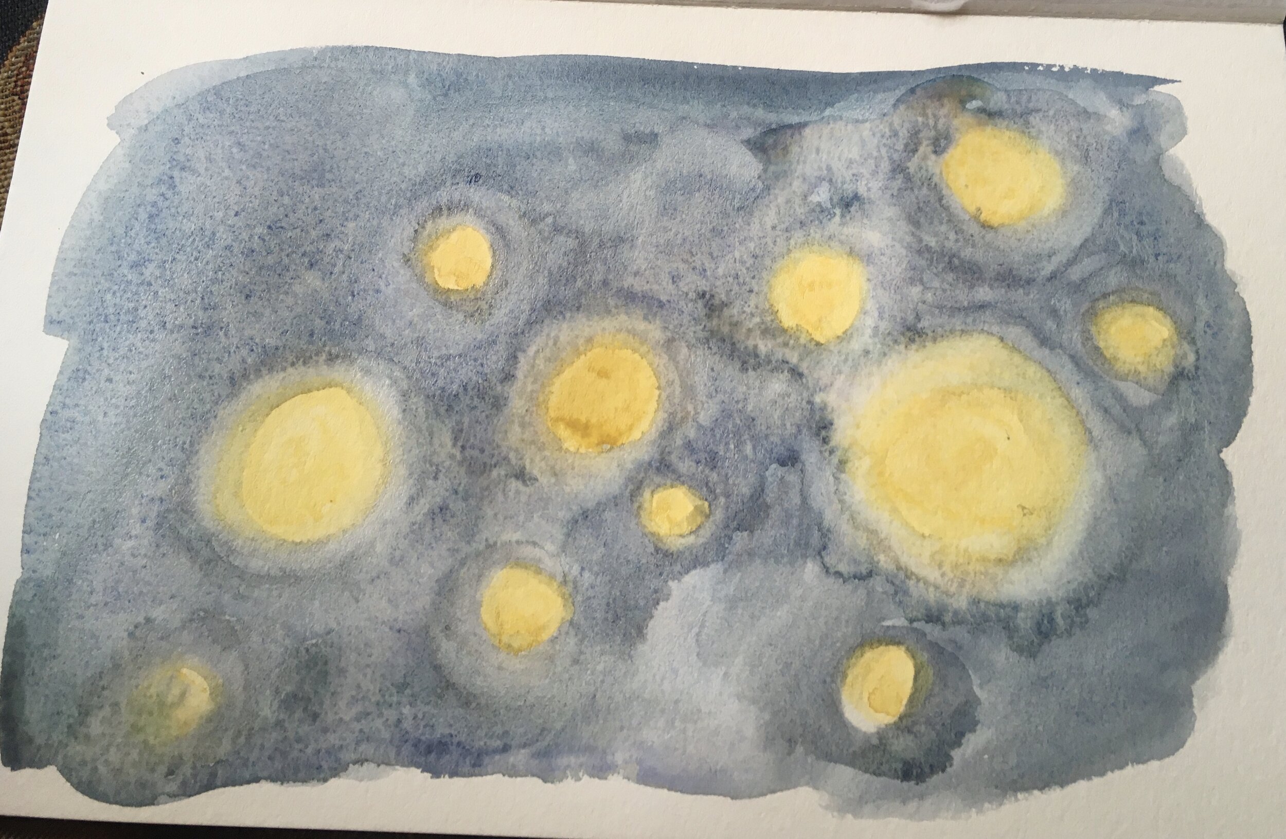
Next, clean your brush and go back over the areas where yellow and blue touch. Add moisture to encourage the colors to mix without ‘scrubbing’ the pigment up from the paper.

Add another layer of darker blue, we are layering for depth.

Add another layer of bright, saturated yellow to the ‘orbs’. This is a good opportunity to mix into the dark background wherever possible. Try to work in circular strokes around each ‘orb’.


Stroke
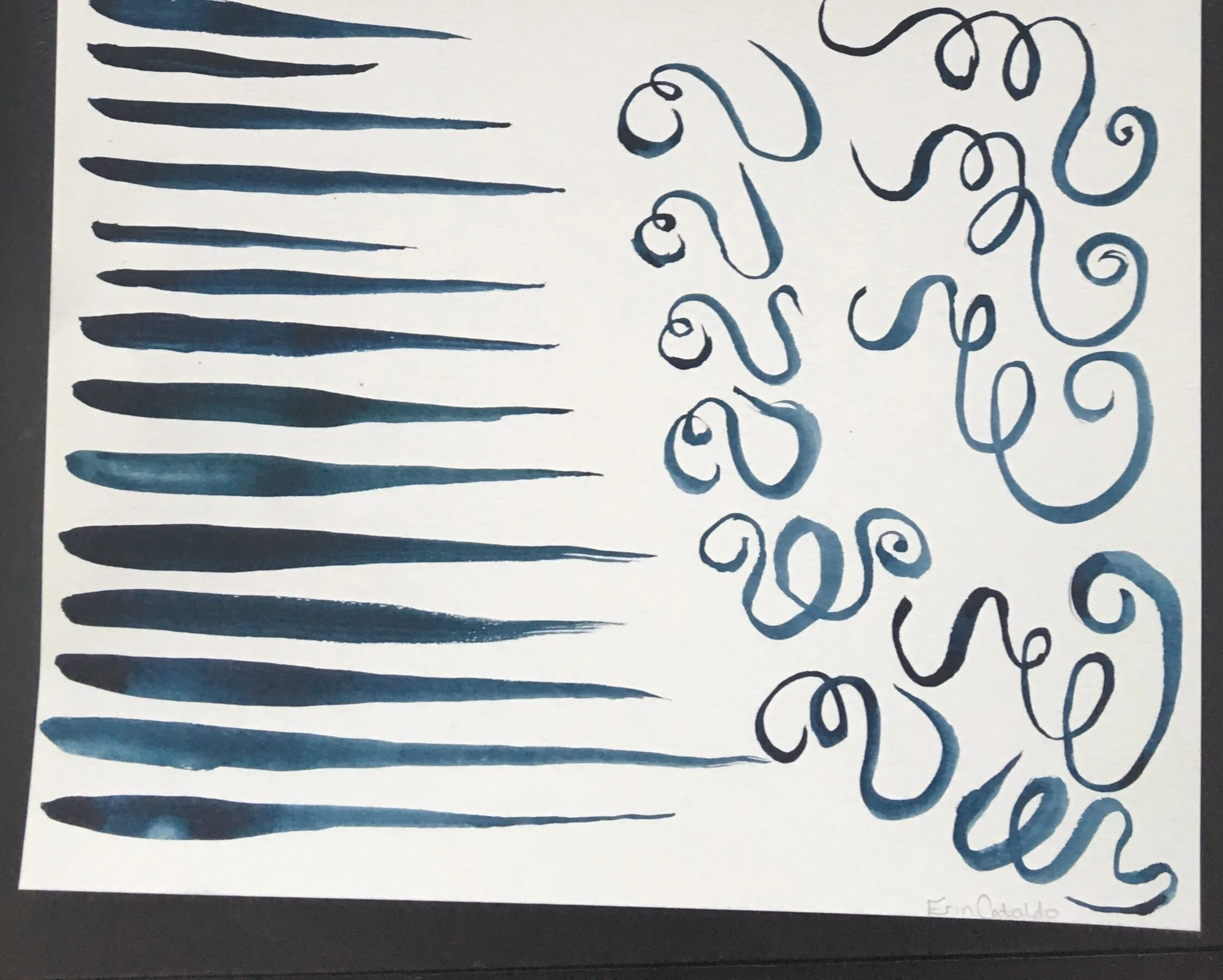
2/3
STROKE: LINE WEIGHT
Fill your brush with saturated, juicy paint.
Create a tapered line by dragging the brush across the page, first moving slowly and applying a lot of pressure, then gradually lightening up and moving faster. This will create a line that smoothly transitions from thick to thin.
Do this several times, focusing on keeping the transition smooth and steady. Our goal is to move from as thick as possible to as thin as possible.
Try varying the length of your line. Is it harder to make long or short tapered lines?
STROKE: MARK
Practice the shapes below with a round brush at least 10 times each.


Begin with a light pencil sketch,
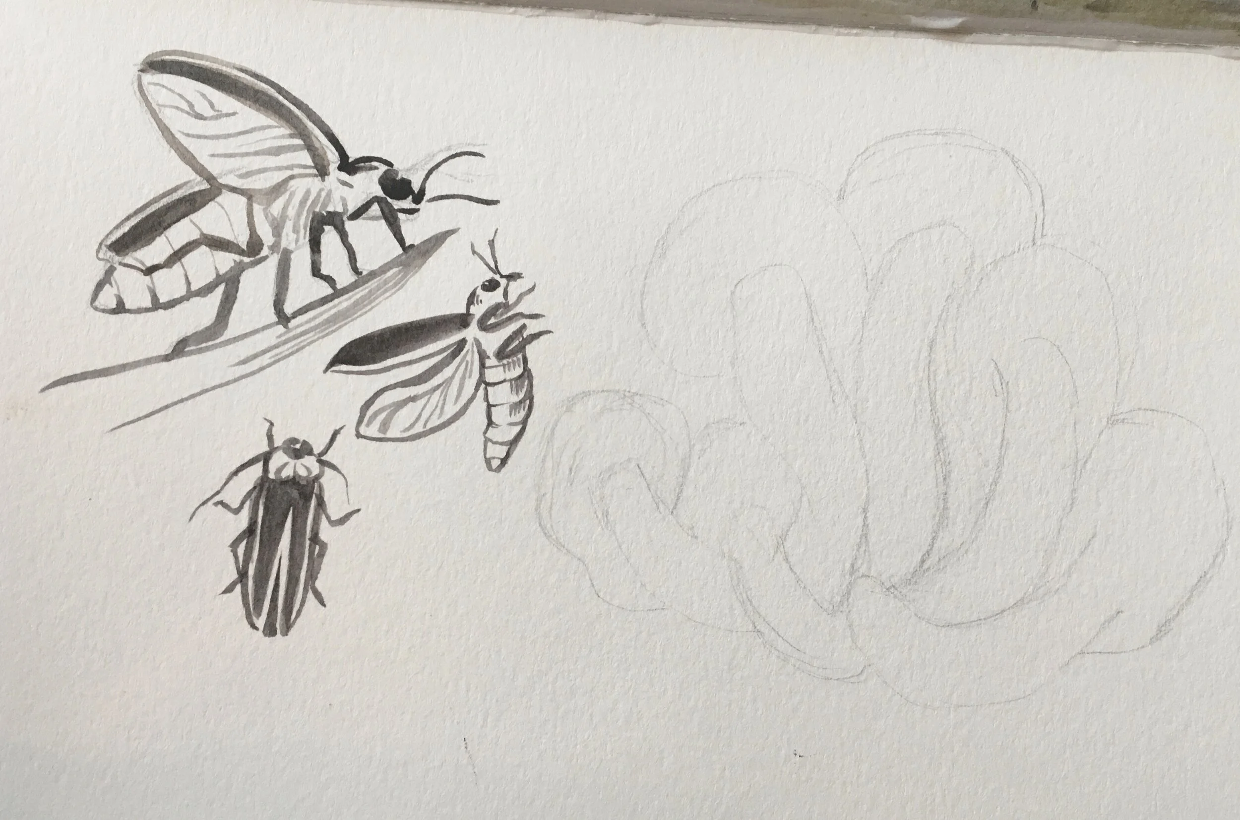
Outline your fireflies delicately with your brush. Remember the pressure sensitivity we practiced, darken lines that are in shadow and that identify features. Use light, thinner lines for detailing.

With a little bit of stoke practice under your belt, return to your firefly painting and drop in some bugs.
Value and Painting From Life

2
2.TINTING: VALUE AND SATURATION
Draw a 3 lines of 1in circles. You may need a new sheet of paper for this exercise. The first line should have 5 circles, the next 6, and the next 7. We will be creating value scales from as dark as possible, lots of pigment little water, to as light as possible, lots of water little pigment.
Begin painting on the right side of the first line of 5. Use paint that is mostly water and a drop of pigment to get the lightest shade you can.
Add a drop more pigment and paint in the next circle, moving left. Keep in mind that we want the to evenly space out the jumps in value to create a gradual transition.
Continue left circle by circle, painting the leftmost as dark as possible.
Continue on to the next rows following the same steps. Each time a circle is added to the row, it will be more challenging to keep your value steps even.
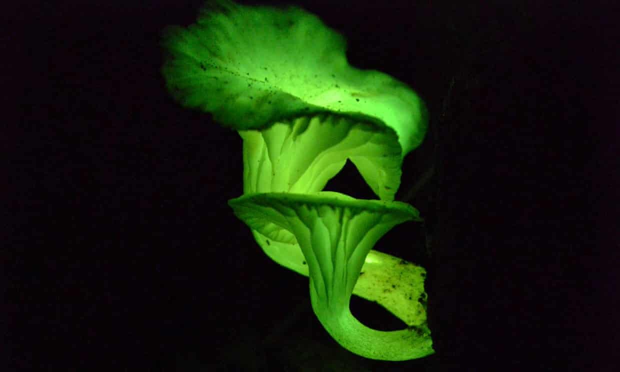


Start with a pencil sketch, focus on edges of forms and not the detail in/on them.
Begin by blocking in all of our shrooms. Use the color that will be the highlight of their ‘glow’- I chose to go more yellow than the green of the photo.

Lay down a dark indigo background. Try to keep each color from touching for now. Work quickly and with a lot of water so that these two shapes can blend together soon.

With a damp brush, join the shapes and allow them to mix.

Start to add value layers. I darkened under the caps where the stalk meets with a yellow-green, and traced the shadows between each stalk with indigo.

Continue building value layers, working light to dark, Darken the stalks with a grey-brown, and outline the curled lip of the mushroom caps.

Add layers and layers to add to the contrast. Use bold dark shapes to clarify and edges that might be getting lost.

Finally, add fine details such as gills and some delicate outlines of each mushroom. You can also add a bit more yellow green to the background in a thin layer.

Here’s another way to think about watercolor layering. You can use a combination of lines, blends, and shape layers to find your style.


Not quite glowing, but here is a great demo about building glazes by Tracy Lewis.
Using Salt for Texture

Planning a Full Page Composition
Below are some examples of illustrators, both modern and historical, that take a creative approach in composing their natural science illustrations.
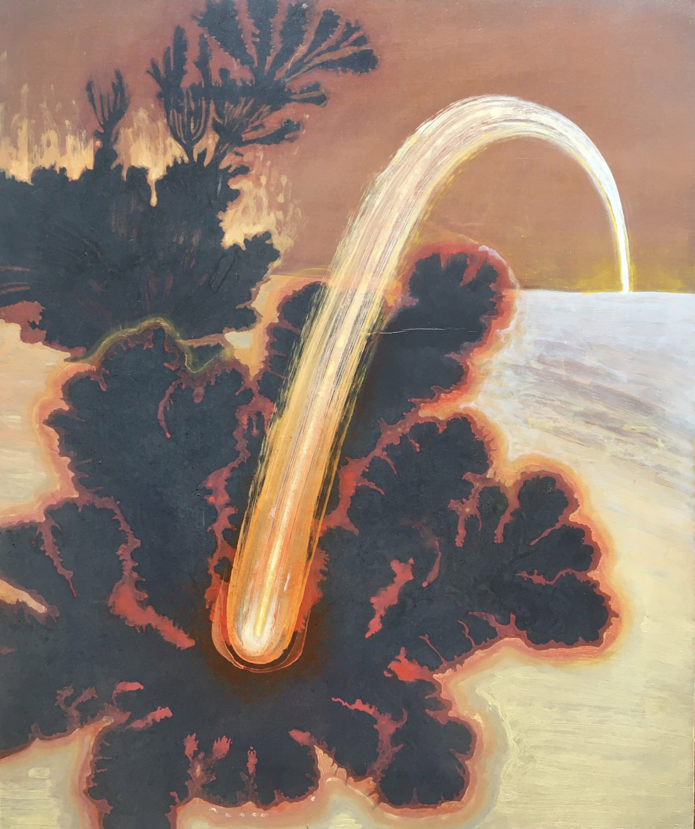
The warm hazy layers near the front of the comet help it to appear to glow. The edges are softer in the front than in the back where it is farther away.
Michelle Blade
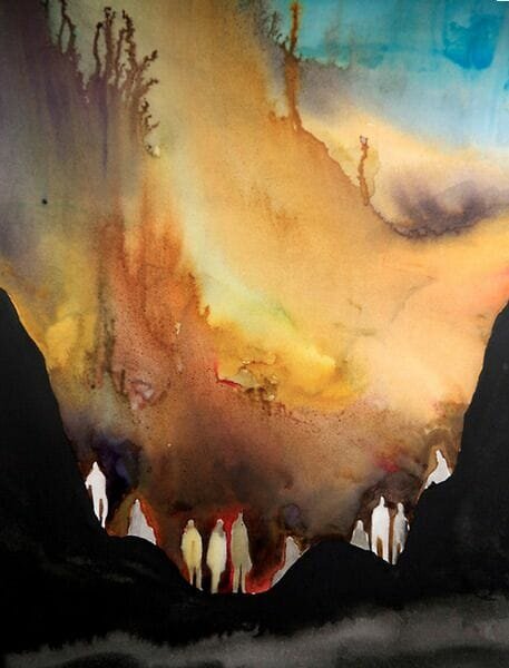
The red haze around the pale figures surrounded by the dark smoky foreground help the silhouettes to glow.
The background gets lighter as each hill recedes, pushing the focus to the high contrast foreground.
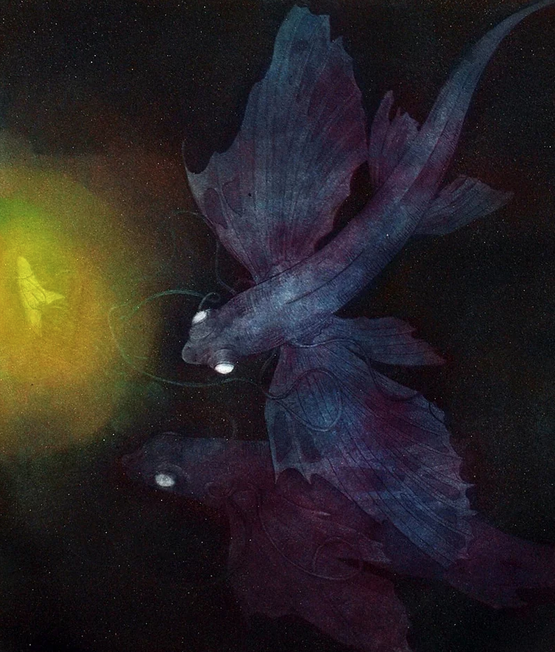
The rich spectrum of hues create an inky atmosphere lit with a bioluminescent fish

Monica Rohan, @monrohan
In this work, attention is drawn to the fireflies by the saturation of their glow. All else feels muted compared to the light.

This artist heightens the glow of the sun by keeping the sun the white of the paper, while all other areas have at least a light hazy wash.

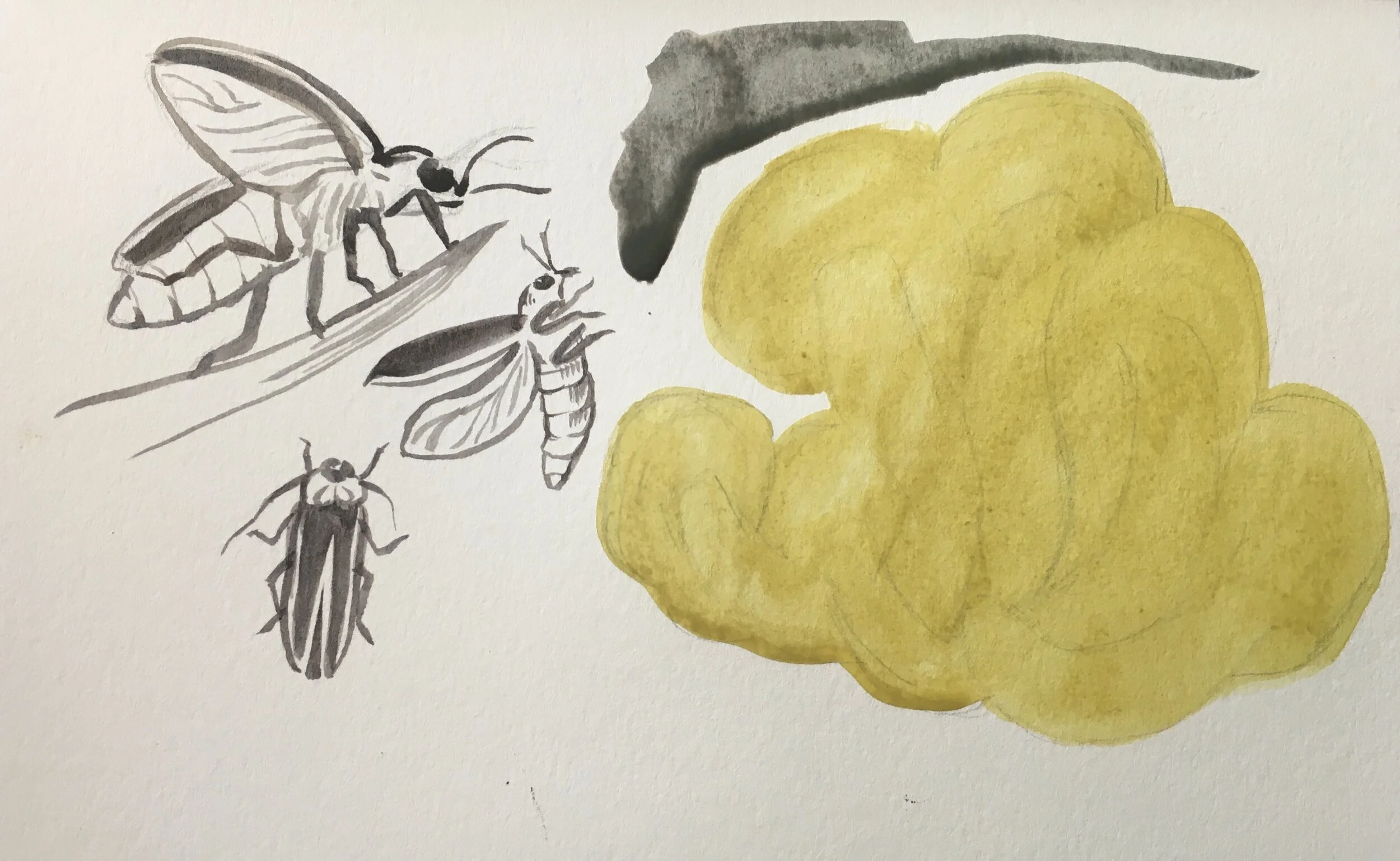
From the dis-bound book German Atlas printed by Bibliographisches Institut Leipzig,Germany in 1894
Artist Dr.Etzold
RESOURCES
Learn more about Watercolor Painting:
About Bioluminescence
Fireflies