Beginner’s Botanical Watercolors
MSU Broad’s ArtLab + Solstice Handmade

Gather Supplies
-water
-paper towel / rag
-2 circle stencils, 1 and 2 in- I use a mason jar lid and a quarter!
-Pencil
-watercolor paper
-brushes
-palette
-3 primary paints: madder/alizarin, cadmium yellow, indigo/prussian blue or similar
Seeds of Resistance
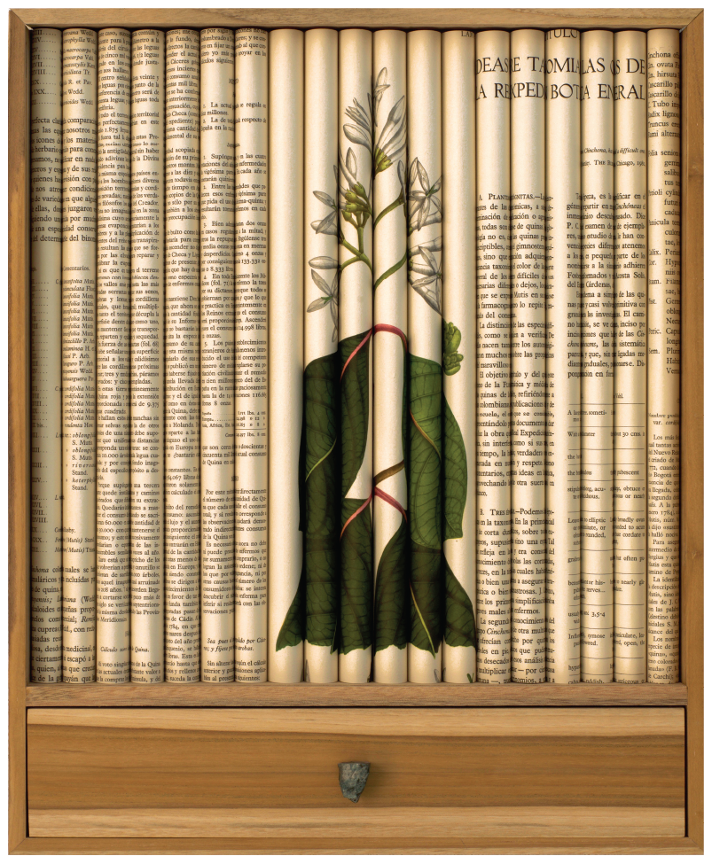
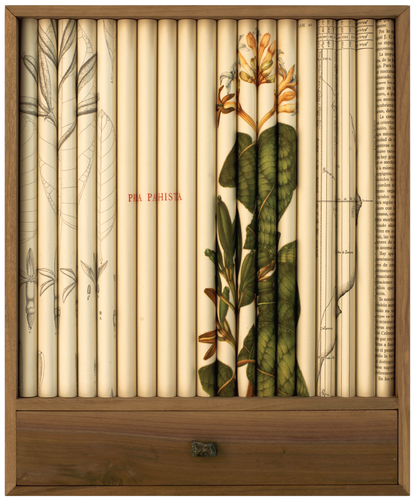
Quinine Dissecting I, II, and III, 2019, botanical illustrations, porcelain cup, stainless steel mesh, glass, quinine bark, teak, optium acrylic, 20 1/4x 16 3/4 x 3 1/2

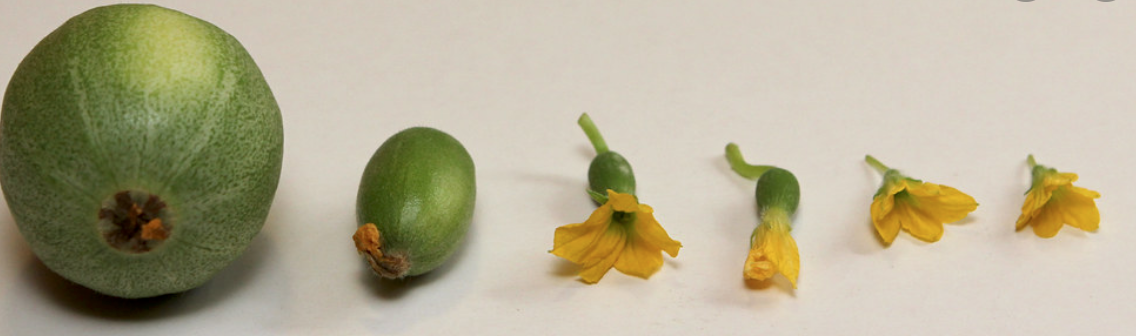
Why Fiber Crops?

Textiles as Resistance
The Regional Fiber Manufacturing Initiative by Fibershed
Climate Beneficial™ goods can meet our basic human needs while reigning in our consumption footprint, and we need a thriving regional manufacturing system to make it happen. Fibershed has developed the RFMI to coordinate and implement a manufacturing strategy that will regionalize the production of textiles and contribute to climate solutions. The Initiative is made up of committees of local and international experts to focus on core issues of Material Production,Manufacturing, Consumer Connections, and Business Services.


1
Watercolor Warm Up
COLOR WHEEL
Use your 2in stencil to draw your center circle first (gray).
Draw your 3 primary 2in circles, equally spaces around the center (magenta, yellow, blue).
With your 1in stencil, draw one circle in between your primary circles for the secondary (orange, green, purple).
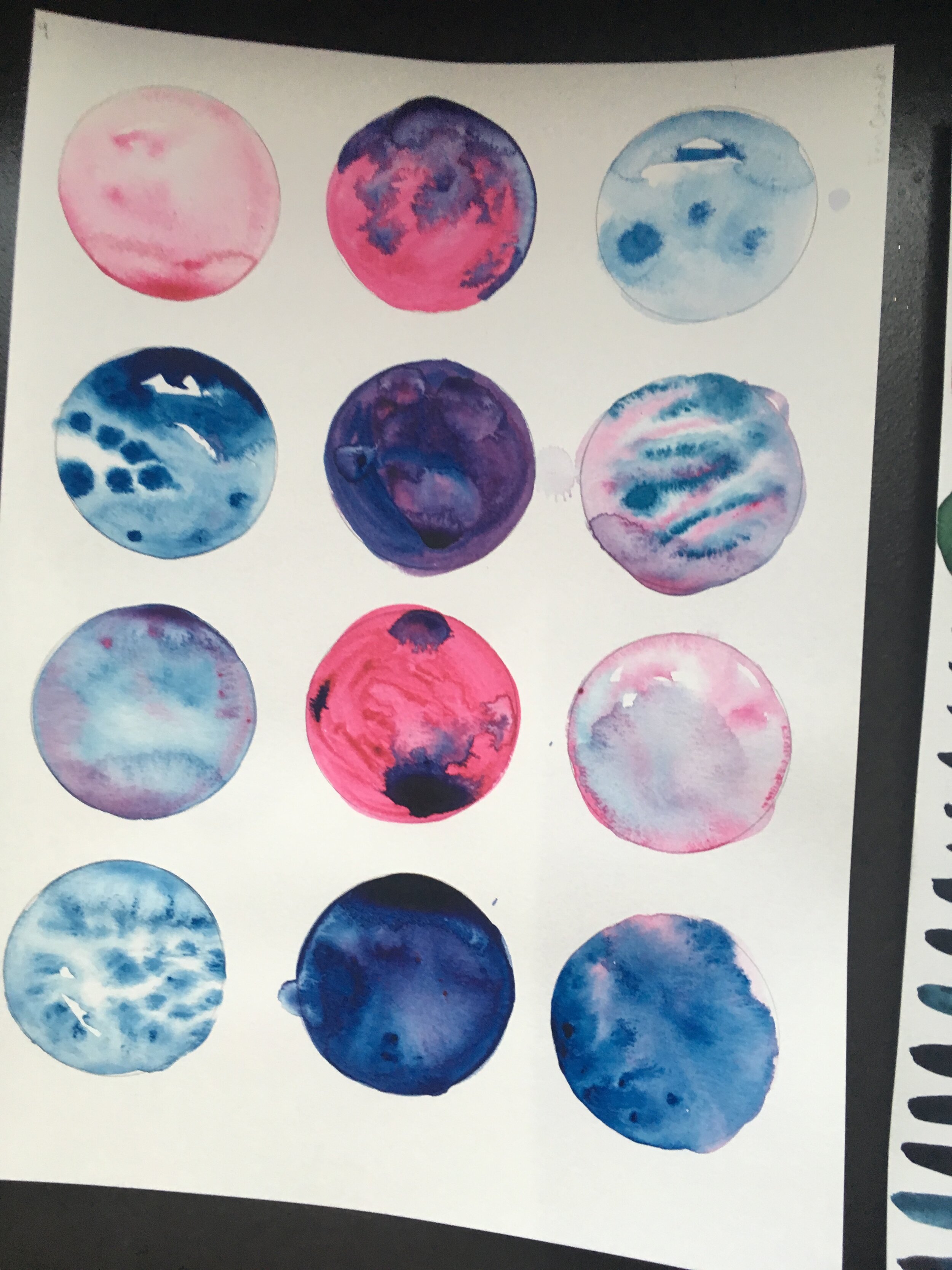
Color mixing
Fill-in your Primaries, straight from the tube. Alizarin/Madder, Cadmium Yellow, and Indigo/Prussian Blue. Begin with yellow, match the diagram to the left. Mix enough water in with the paint that it is saturated and flows freely. Use a large brush, use a lot of juicy paint, and try to wet the entire circle quickly, so that it doesn’t begin to try as you’re filling it in. Fill in Magenta, then Blue.
2. Fill in your Secondaries. Choose a 1in circle to start with, then mix together the primaries next to the chosen circle, to create a secondary color. For example, if I choose my top right circle, I would mix yellow and orange to create orange. Mix yellow and blue to create green, then red and blue to create purple. Try to mix colors in equal amounts, aim for a hue right in-between the primary colors. You don’t want yellow-green or blue green, you want a true middle green.
3. Fill in your Neutral Gray, center circle. Mix together all 3 primary colors to create a neutral hue. If the neutral begins to tend towards a certain hue, add the color’s compliment. Complimentary colors are located straight across the color wheel from each other. For example, if my grey was tending red, I would add green to get closer to a neutral gray.
WET BLENDING
-Use the large circles at the top of the page to practice blending colors.
-Begin by filling one entire circle with water. Then, fill your brush with paint and gently touch the tip of the brush to the wet circle. Watch the way the color spreads and creates ridges as it dries- this effect is called a bloom
-Choose a cricle to experiment with the oppoite effect- fill the circle with a dark value of paint, and while it’s still wet, touch a brush full of water to the shape- watch the way the water pushes the pigment on the page outward from your brush.
These marks change as they dry. If you don’t like how they’re looking, add water or paint to adjust accordingly. You can also influence the way the paint flows by tilting your paper.
Applying Color Mixing + Wet Blending…
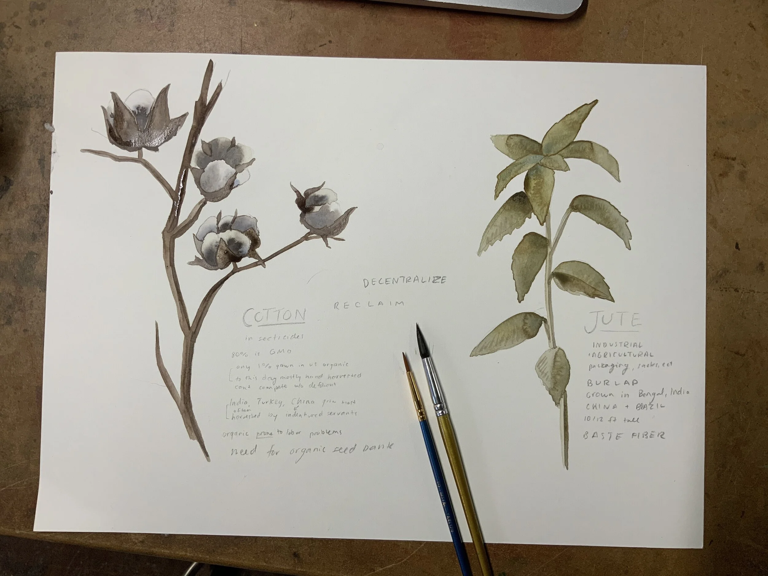
PAINTING JUTE + COTTON

COTTON
“The cotton plant belongs to the genus Gossypium of the family Malvaceae (mallow family); the same family as hollyhock, okra and hibiscus. It is generally a shrubby plant having broad three-lobed leaves and seeds in capsules, or bolls; each seed is surrounded with downy fiber, white or creamy in color and easily spun. The fibers flatten and twist naturally as they dry. There are different species of Cotton – Gossypium hirsutum, Gossypium barbadense, Gossypium herbaceum and Gossypium arboreum, the first two species being the most commonly cultivated.”(read more)

JUTE
“Jute, Hindi pat, also called allyott, either of two species of Corchorus plants—C. capsularis, or white jute, and C. olitorius, including both tossa and daisee varieties—belonging to the hibiscus, or mallow, family (Malvaceae), and their fibre. The latter is a bast fibre; i.e., it is obtained from the inner bast tissue of the bark of the plant’s stem. Jute fibre’s primary use is in fabrics for packaging a wide range of agricultural and industrial commodities that require bags, sacks, packs, and wrappings. Wherever bulky, strong fabrics and twines resistant to stretching are required, jute is widely used because of its low cost. Burlap is made from jute.” (read more)
Just like we filled in our traced circles to practice wet blending, we will be filling in simple shapes with paint and water.
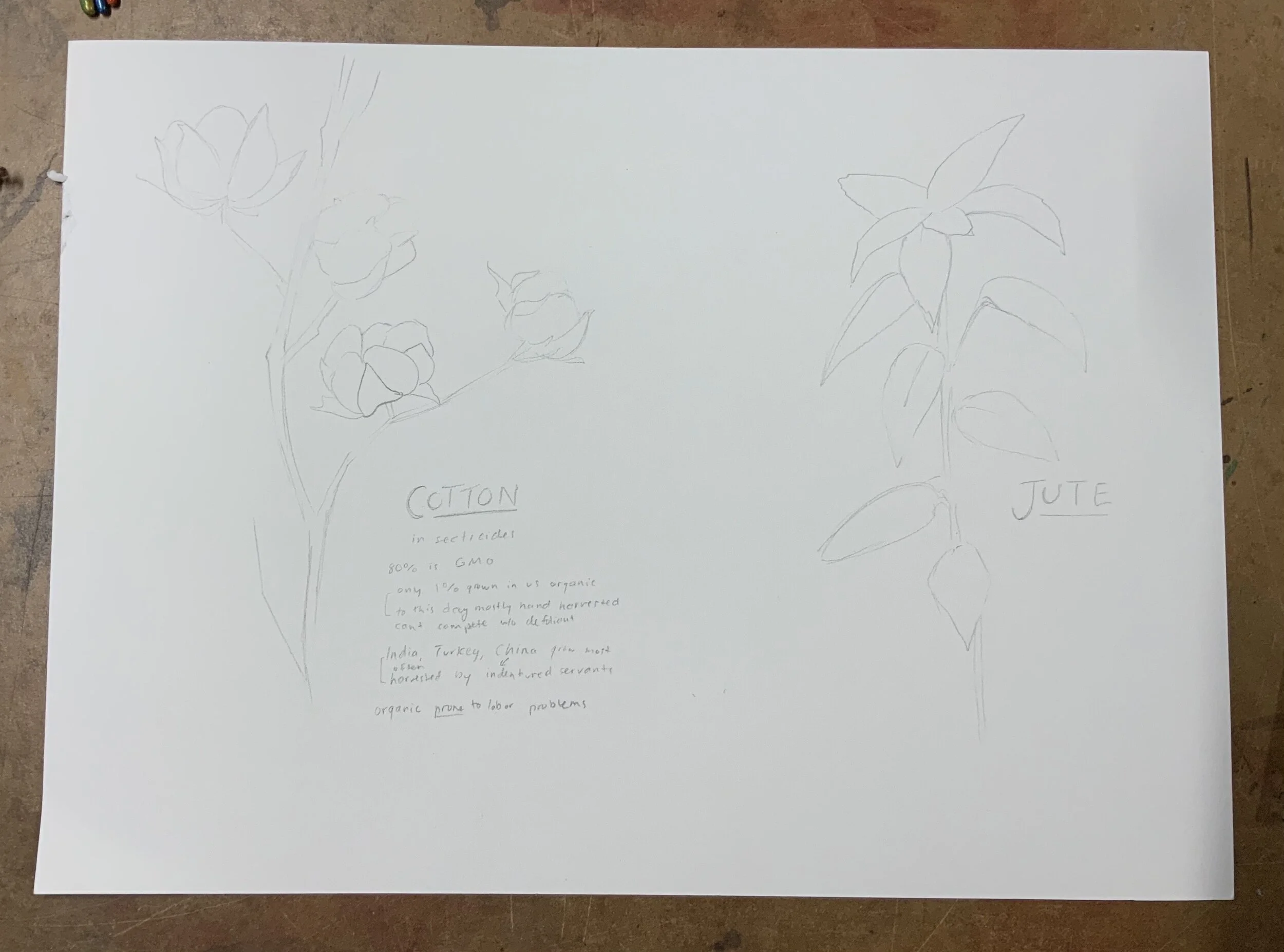
1.Begin by sketching the silhouette of each plant. Keep it simple, stick to an outline and skip any details.
2.Mix your colors. For cotton, we will use a neutral gray like the center of your color wheel. For Jute, see the photo above.
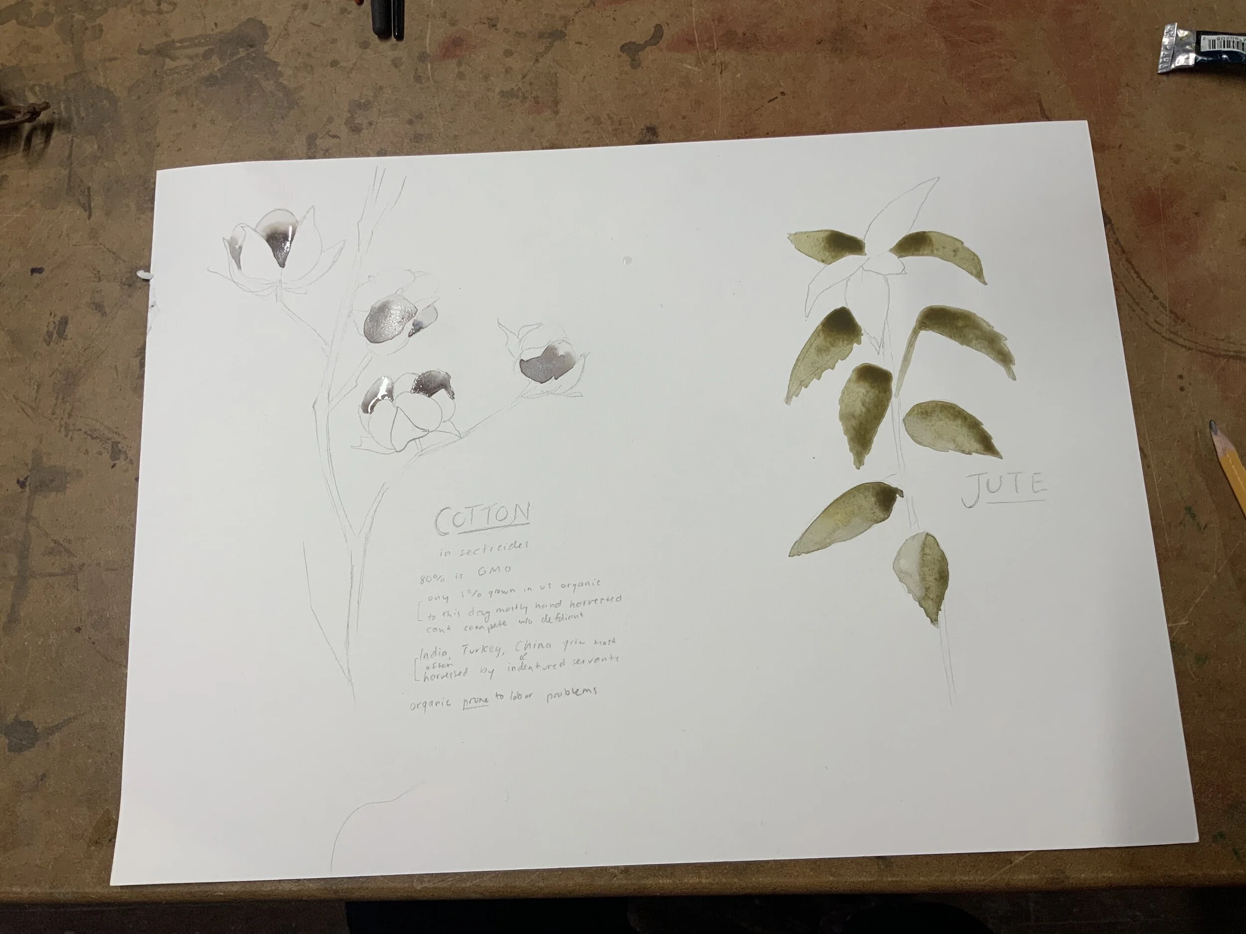
3. Fill each outline with ample water, then begin dropping color into the wet shapes. Consider where the light source is, and try to stay consistent with your shadows. Be mindful to break down forms into smaller shapes and work with them one at a time - leaves, cotton ‘balls’ especially. If two wet shapes touch pigment will bleed between shapes.
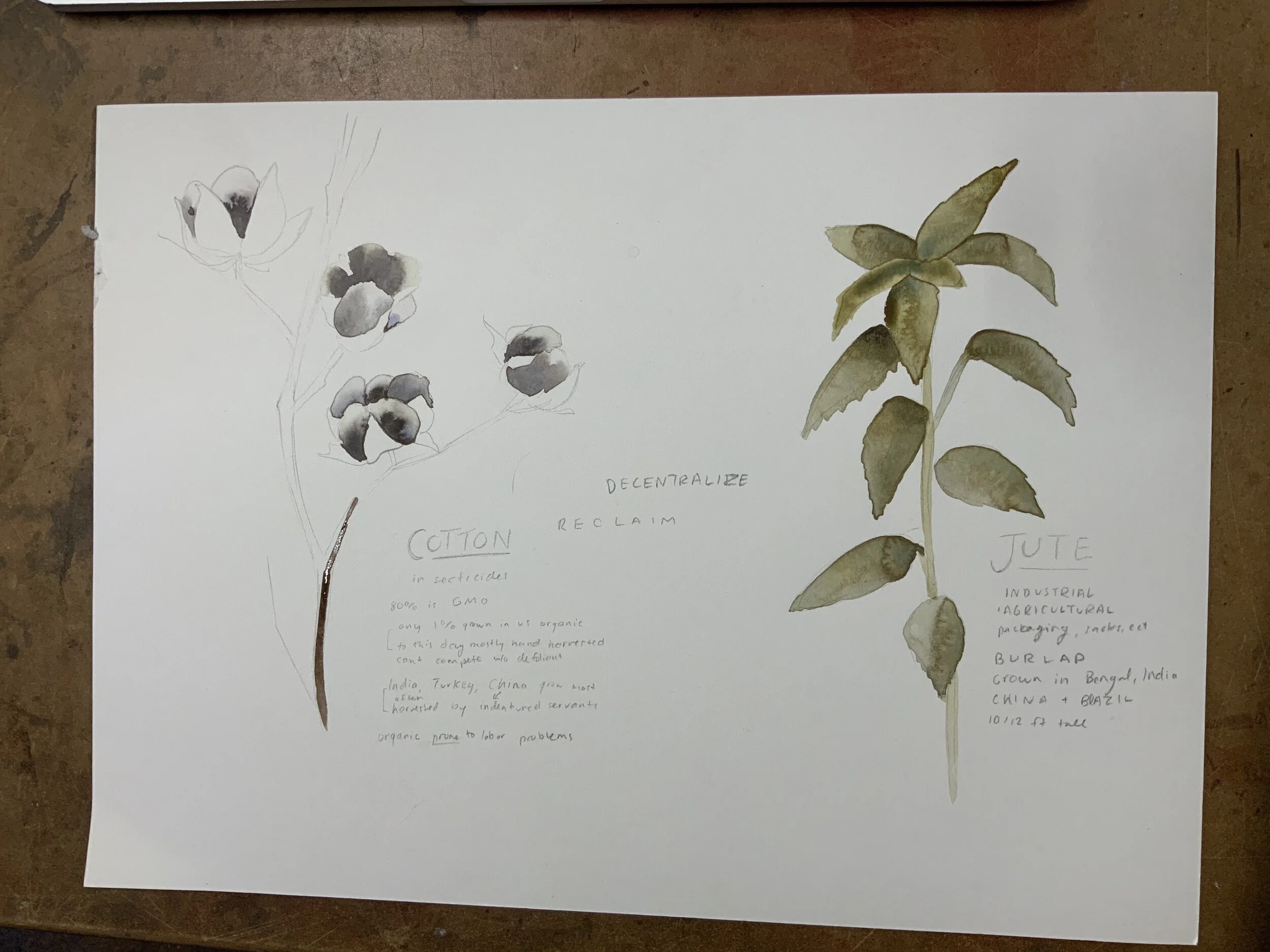
4. Continue filling in shapes, as one layer dries you can paint shapes next to the previous. Continue, even with the brown leaves around the cotton, until all shapes are filled. Stop at this point, we will come back to detail later.
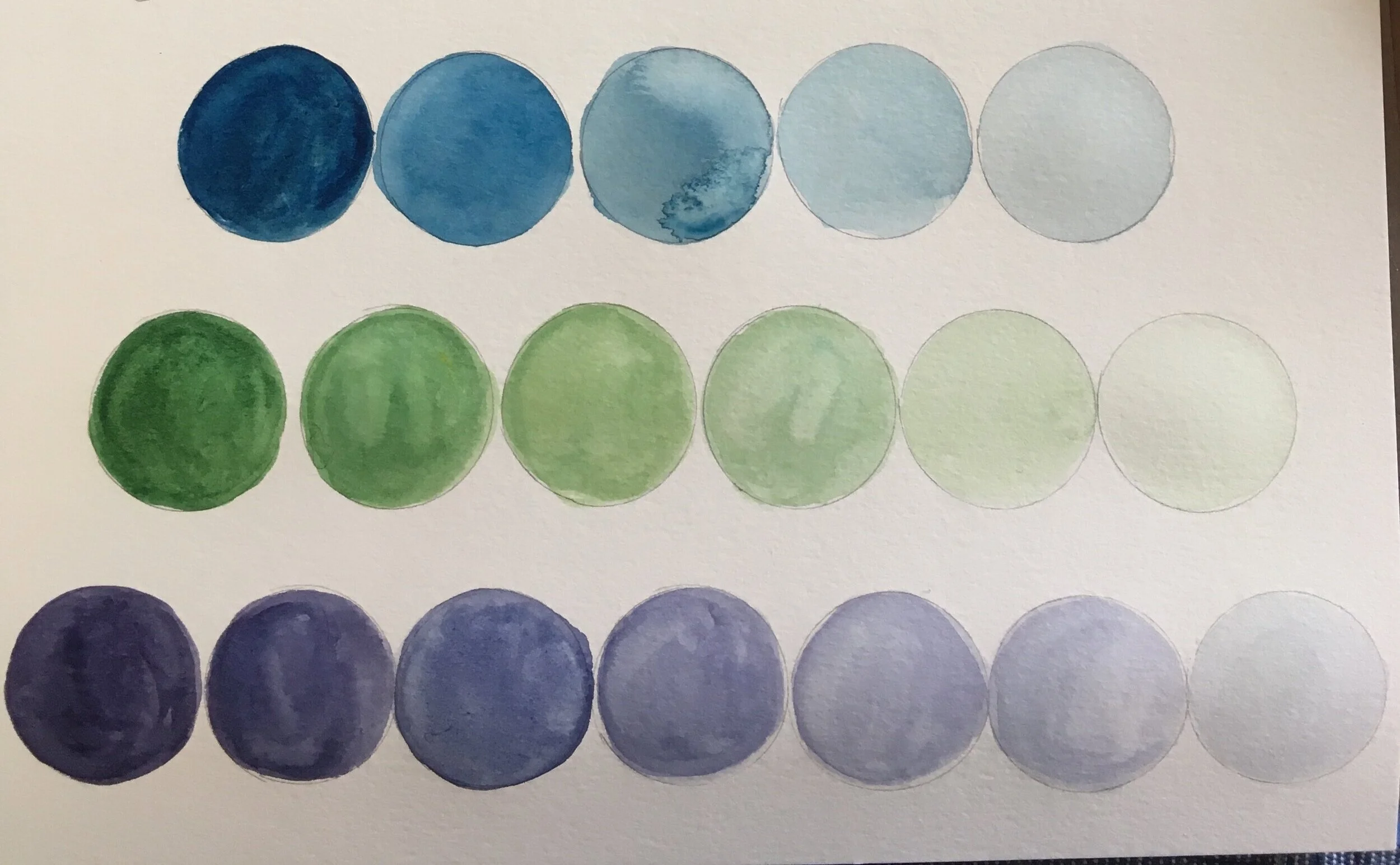
2.TINTING: VALUE AND SATURATION
Draw a 3 lines of 1in circles. You may need a new sheet of paper for this exercise. The first line should have 5 circles, the next 6, and the next 7. We will be creating value scales from as dark as possible, lots of pigment little water, to as light as possible, lots of water little pigment.
Begin painting on the right side of the first line of 5. Use paint that is mostly water and a drop of pigment to get the lightest shade you can.
Add a drop more pigment and paint in the next circle, moving left. Keep in mind that we want the to evenly space out the jumps in value to create a gradual transition.
Continue left circle by circle, painting the leftmost as dark as possible.
Continue on to the next rows following the same steps. Each time a circle is added to the row, it will be more challenging to keep your value steps even.

STROKE
To practice outlining and detailing, we will practice calligraphy drills.
1.For the first row, make a diagonal line by moving your brush downward. Apply some pressure to create a heavy line.
2. Make a diagonal line by pulling your brush upwards, keeping the pressure light to create a delicate, thin line.
3.Curve the tips of the diagonal line you have previously painted, creating an S shape. Try to replicate the line weight shown here, thicker on the vertical part.
4.Paint some U shapes- pushing down for a thick line on the downstroke, and thin on the upstroke.
5. The opposite of 4- paint some arches.
6.Combining what we have practiced, create an O. Keep your line weight in mind. Break up the circle into halves, stopping when you change stroke direction, to help with consistent symmetrical shape.
7. Try out some of the swashes in the bottom image - then try it again! See if you can create 5 swashes that look nearly identical.

Applying Value + Stroke…
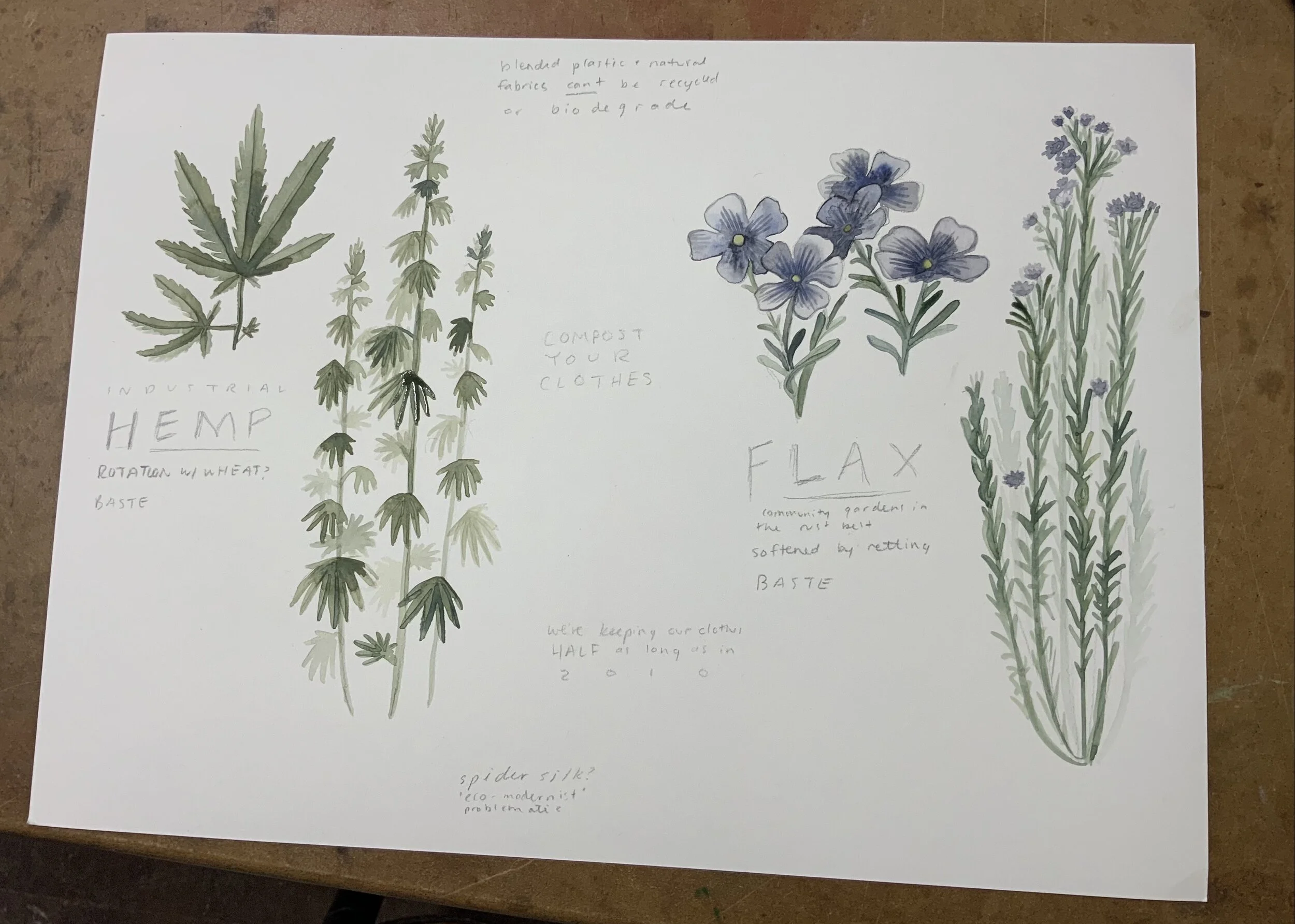
PAINTING HEMP+FLAX


INDUSTRIAL HEMP
Industrial hemp means a plant of the genus Cannabis and any part of the plant, whether growing or not, containing a delta-9 tetrahydrocannabinol (THC) concentration of no more than three-tenths of one percent (0.3%) on a dry weight basis.(Colorado Dept of Ag).
The stalks of the hemp plant consist of two layers: The outer layer is formed from rope-like bast fibers, and the inner layer consists of a woody pith. Only the outer layer of the Cannabis sativa stalk is used for textile purposes; the inner, woody layer is commonly used for fuel, building materials, and animal bedding.
Once the outer layer of bast fibers is stripped from the hemp plant, it can be processed and made into rope or yarn. Hemp rope is so strong that it was once the premier choice for rigging and sails on maritime vessels, and it remains renowned as an excellent material for clothing that surpasses cotton and synthetic textiles by most metrics. (sewport)


FLAX
(Linum usitatissimum), plant of the family Linaceae, cultivated both for its fibre, from which linen yarn and fabric are made, and for its nutritious seeds, called flaxseed or linseed, from which linseed oil is obtained. Though flax has lost some of its value as a commercial fibre crop owing to the availability of synthetic fibres, flaxseed has grown in popularity as a health food, and flax remains economically significant in a number of countries around the world, including China, Russia, and Canada.
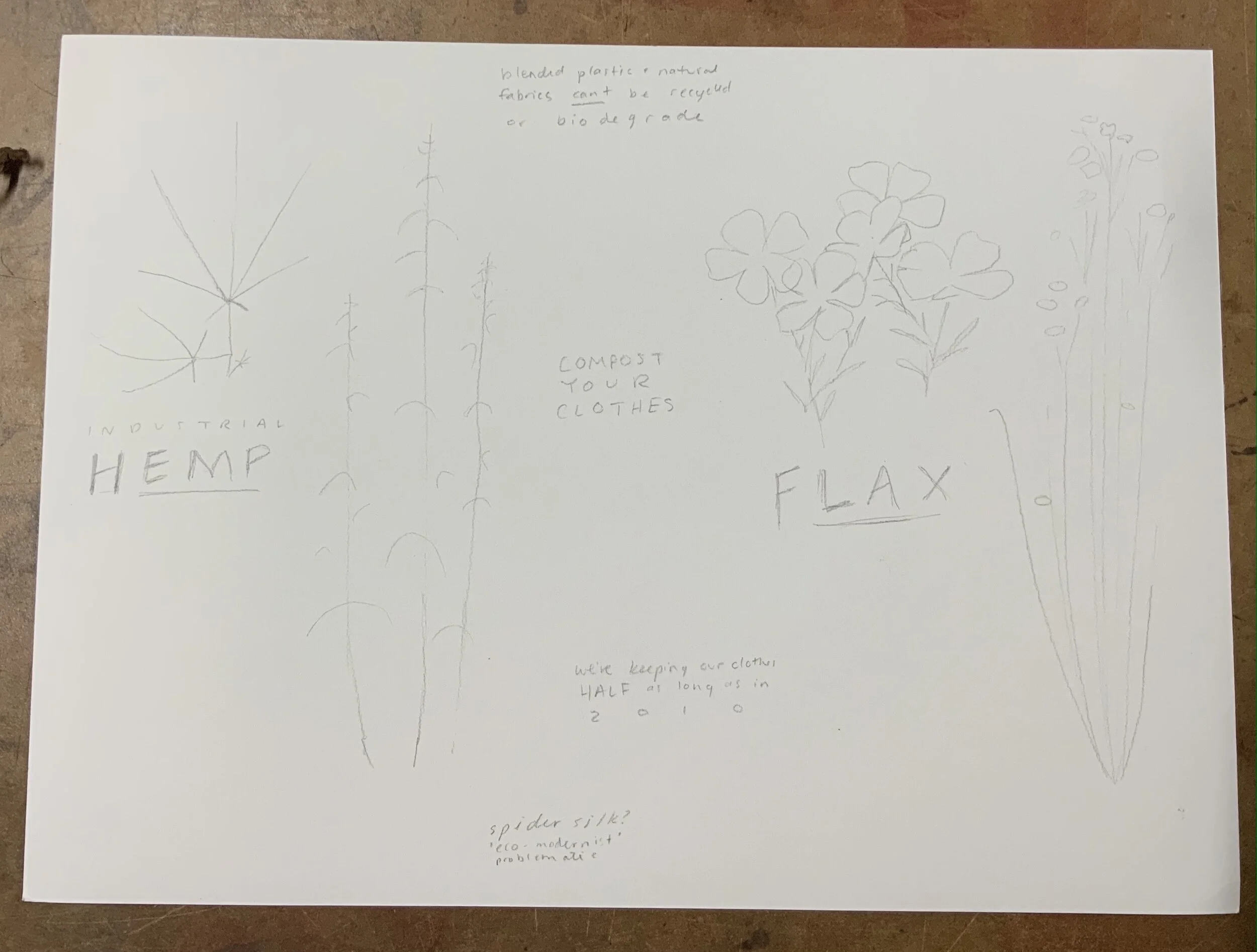
Pencil sketch lightly, focusing on overall shape instead of detail. Draw the stems and center veins of leaves first, then build off of this framework in the next step.
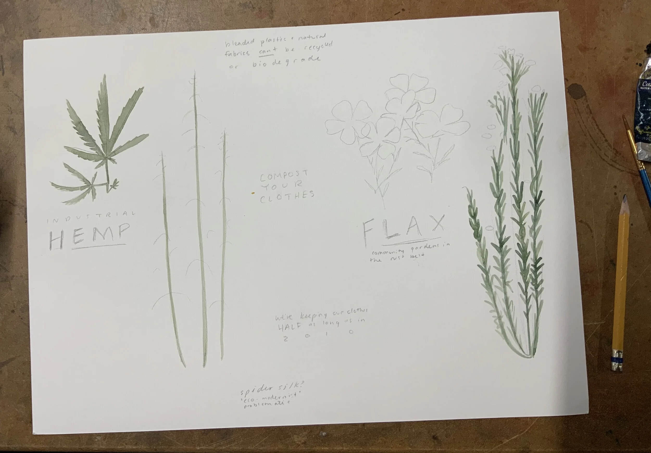
2. Using controlled, consistent stroke like we practiced, trace the stems sketched in pencil. For the hemp leaf, layer parallel diagonal strokes to build a leaf half with a serrated edge. For the flax, with a small brush, add slender, curved leaves along the stem, that branches at the top into flowers and buds.
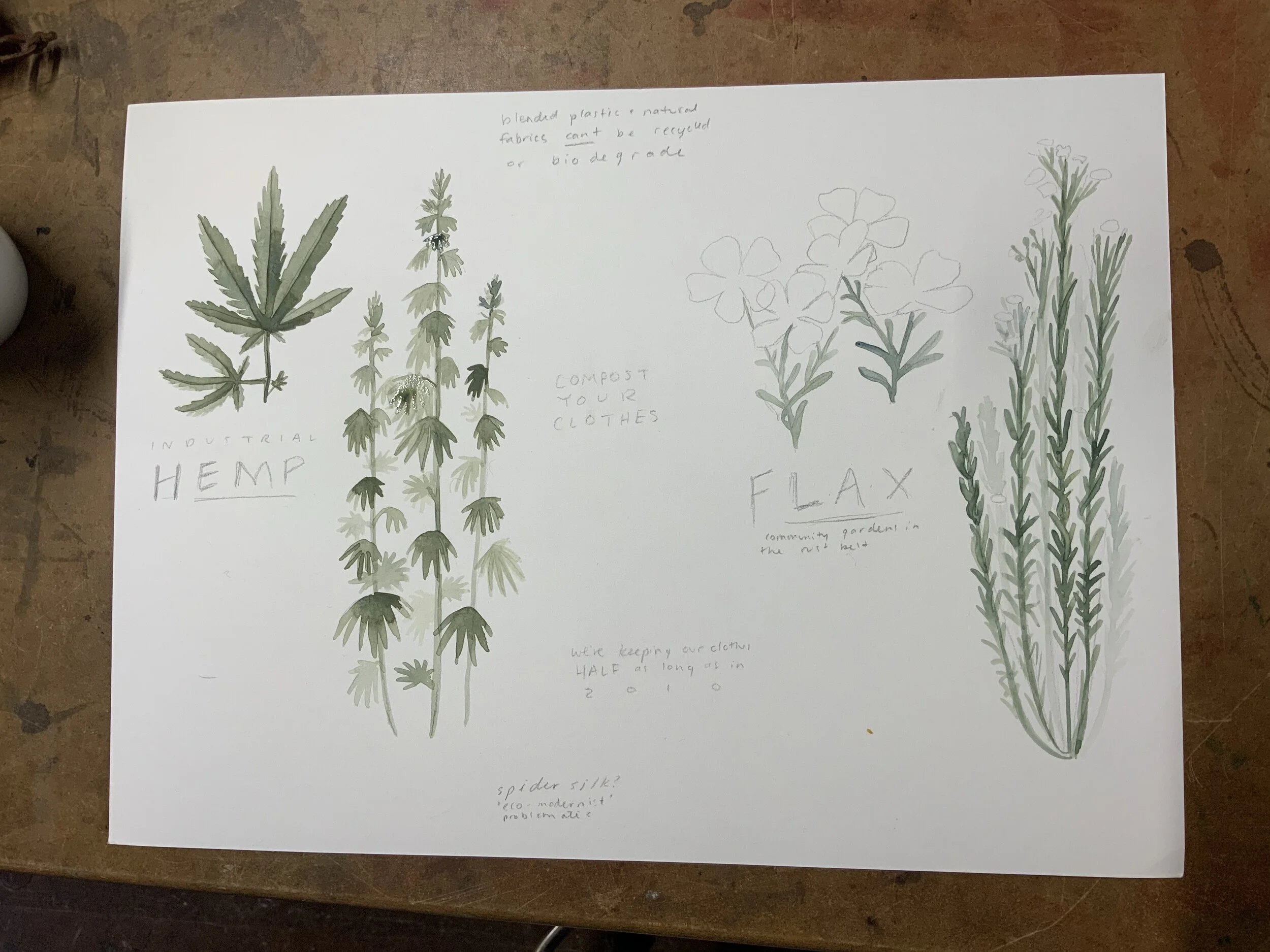
3. Add star shaped leaflets to the hemp plant, they often curve downward like an umbrella. Consider the value of your paint strokes- darker in the foreground, and lighter in the background to create depth. Then, return to the hemp leaf and paint the other half of each individual leaf, intentionally using a more saturated paint. On the flax flowers, add the stems
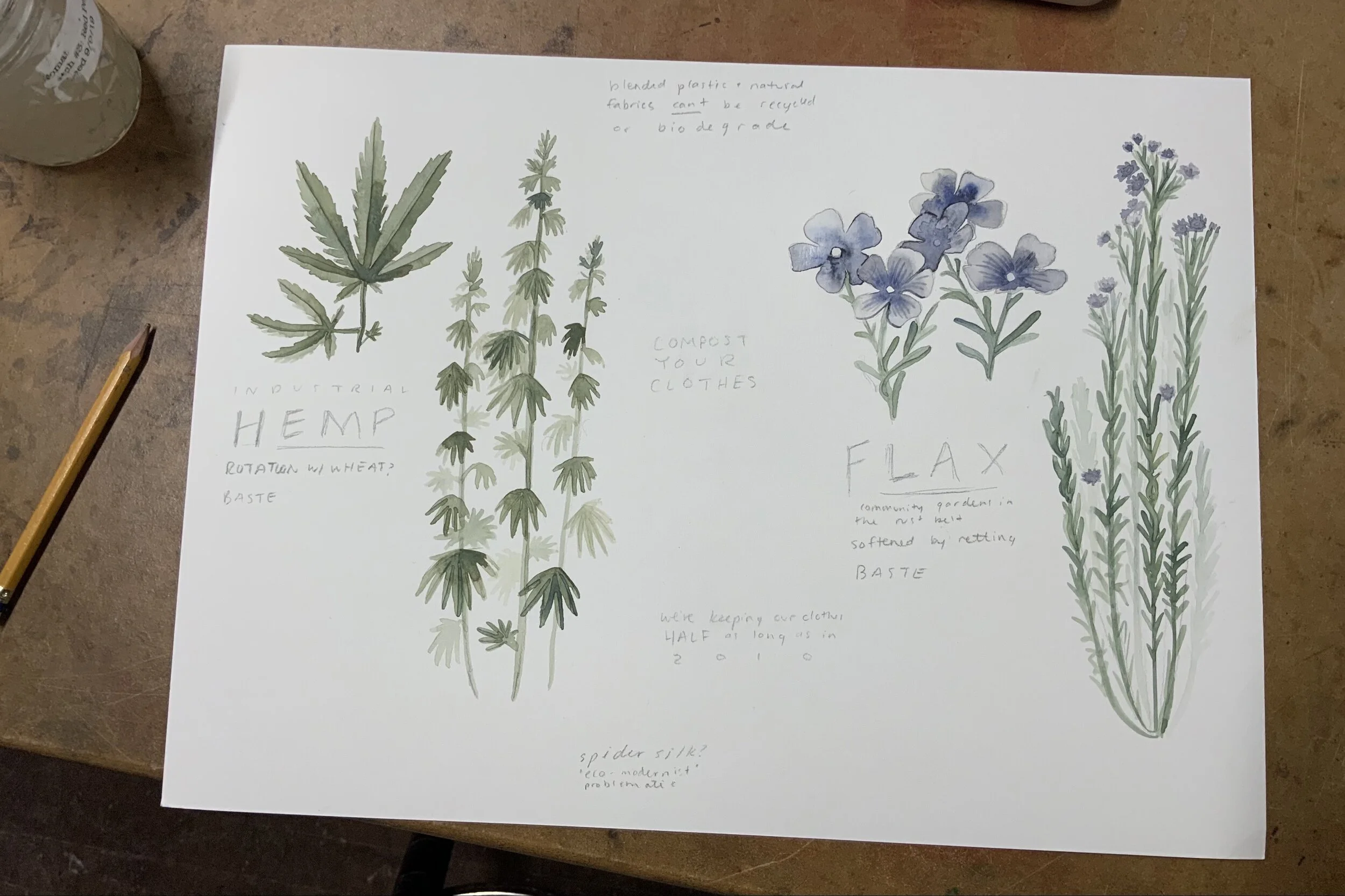
4. Continue to layer brushstrokes of a mid value green onto both plants leaves, building up shadows where leaves overlap, and on the shadow side.
5. Move on to the flax flowers, using wet blending as we previously used for cotton and jute leaves as a base layer. Fill the flowers with water except a dry small center point. drop blue paint near the center of the bloom, encouraging it to flow towards the tip of each petal.
Putting the Techniques to Work: Painting Realistically


1- Painting with Calligraphic Lines
Practice painting with only calligraphic lines.
-Keep you paint a dark, saturated value.
-Paint like you’re drawing with a marker-Be mindful of your line weight, pushing your brush into the paper to created wider lines in places that are in shadow or darker. Use smaller, thinner, lines for delicate details and soft edges
2 - Painting Wet on Wet
Practice paintingwith no lines, using the wet on wet blending technique
-Wet the paper one petal at a time to control which areas bleed into one another.
-Drop more paint in areas that are in shadow
-Create blooms in areas that are logical to your bloom-to blend colors and/or to mimic textures
3 - Combining Techniques
-Begin this step by repeating the wet on wet technique from exercise 2, making adjustments this time to fine tune the color and value placement.
-Next, asses your edges- where you aren’t happy with the edges created by painting wet on wet, or where detail needs to be added, add in some linework from exercise 1.
With this in mind, continue to layer strokes and shapes onto each plant study. Working light to dark, build up the shadows and details.
For your Future Projects:
Planning a Full Page Composition
Below are some examples of illustrators, both modern and historical, that take a creative approach in composing their natural science illustrations.

Maria Sibylla Merian,
“Mullberry Leaves and Fruit”, 1830
This artist is mindful of the movement in her etchings, bending twigs into an oval frame and using realistic objects into decorative elements
late 1770s
Seba’s strong suite is symmetry, his series of snake prints use the bodies of the animals as line to make patterns across the page. He often includes hints of landscapes in his work.

Teagan White is the master of a limited color palette, while still achieving hyperrealism in her haunting paintings.

Ernst Haeckel,
Fungi : Plate #63, 1899
Haeckel’s work is highly technical and detailed, he chooses to stack the page with a cluster of black and white illustrations. Though they all have vastly different textures and shapes, the layout is symmetric and measured out in a grid.

John James Audubon,
Snowy Owls, 1882
I am personally so fond of John Jame’s Audubon’s use of a dark background with hints of cloud details, to contrast light colored birds in the foreground.

A Rainbow Of Fungi, 2017
RESOURCES
Learn more about MSU Broad’s Seeds of Resistance
Learn more about Fibershed
Learn more about Illustration from Solstice Handmade
Learn more about fiber crop plants
-MSU Extension Industrial Hemp Production
-What is Linen and How Sustainable is it?
Learn more about sustainable Textiles
-TEDx: The high cost of our cheap fashion
-Clothing Matters, a Grand Rapids small business, has a fantastic blog